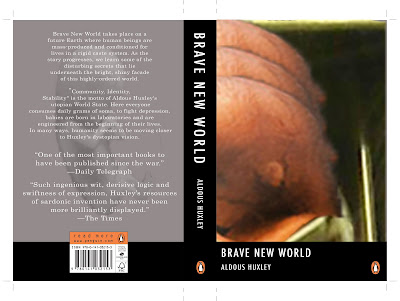
Redesigning the cover of Brave New World
This part of the brief challenged us to look at the many ways in which we could illustrate the cover of our book, keeping in mind the story, its visual mood, demographic to aim at and making it eye catching enough to stand out amongst other books if it were in a bookshop. Easy enough, NOT. The start of this work was working on our layout sheets to draw out all our ideas before touching a computer, this helped immensely as I had a much easier job working out the idea when I had the concept visualised in front of me. Having taken notes on quotes and themes while I was reading the book, I had some reference material to work from straight away and later I went back to some parts to read again to see if anything really jumped out at me. I enjoyed this part a lot but at the same time I think I could have done more experimenting with more physical objects and photographs of anything I could find to give another dimension to the covers. Next time I get a chance I'm going to try to mix it up a bit more.

SOMA, being central to the story I thought that using the pill caps
of the drug soma would be a good angle to work with. |
|
 |
| I swear this one is a bit trippy when you stare at it! |
 |
"The optimum population", said Mustapha Mond, "is modeled on the iceberg,
eight-ninths below the water line, one-ninth above" |
 |
| It's a soma world. |
 |
As much as I really like this cover I don't really think it's a good idea to give
away the ending of the book on the front cover, (oops, sorry to anybody who hasn't read it, nothing happens,
they're all happy ever after, o_o , I swear). It's at the very end and all the way through reading
the book I don't think you would get the reference. |
 |
| The 5 caste colours in the story, as simply as I could. |
 |
I thought that these four covers would make a good series of covers for the book.
This is the foetus in a (vending) machine portion of the design which was
narrowed down as the best choice to get a final piece from. |
 |
| This had all started in a weird little sketch. |
 |
Nearly there. I really like the classic style of a book cover with a thick bar where the title goes, with a crisp border.
Possibly though the image on the whole page might have more of a dramatic effect. |


No comments:
Post a Comment