Sunday, May 22, 2011

Final project of first year : Positive Ireland

Easter break over, entrance into graphics achieved and then this. This slightly confusing and open brief was thrust upon us for the final 3 weeks of the year and heads were scratched when it was given out. What was positive and what was thinking outside of the box 'positive'? Our objective was to create a billboard, a t-shirt and a free give away item that would go with the aforementioned 'Positive Ireland' tagline, easy, pfff, not. So my first port of call was 'sex sells'. I wanted to base the project around the notion that sex could sell the culture of sport in Ireland. Innuendo and punnage was going to be my modus operandi for the brief and by the end of the first week at the first crit the idea was slightly shot down and the issue of 'already been done' and 'clíché' was brought up and so it was a return to the drawing board for a different approach. Lines such as: Where's your balls?; Grab your balls and play; Grow some balls and play( with potted plants growing sports balls); Golf is for swingers; There's grass on the pitch, let's play; and one last apparently controversial one of a child holding a rugby ball saying 'when I grow up I want to be a hooker', were all knocked back in one way or another. Smart and all as I thought they were at the time I knew further investigation of the topic was in order. I knew that I wanted to use sport in some way and then I thought of pushing sport as an alternative to a drink and drug lifestyle, so more puns were in order. We are a nation that has been known to be partial to a drink or two, or the occasional foray into the illicit economies, so i took the angle that I would approach the pitch in a pro sport/anti-drink/drug message. I wanted to come at this with a tongue in cheek approach that mixed the worlds of sport and drug taking in a somewhat marketable manner that made sport out to be the alternative to a wasteful lifestyle. I think some of my ideas came across as slightly run of the mill, safe approach. I don't think I was the only one that struggled with this concept but I know myself that I could have done a bit better. Did the stream run out? I'm not sure. This is the final piece of my first year puzzle:

Billboards:


 T-shirts:


 Free give away:


My idea for the free give away item boiled down to aiming my pitch at drug addicts and people on the streets. These are stickers that I would display around the city centre with the hope that they would draw people in at first with the bright colours and then they might read more into them and the seed of wanting to get help might be planted.

These final two pieces were two that I wanted to make for myself as posters for me to keep, a bit of a non connection to the brief, oops.

International horticulture time.

Am I exposing, flashing, or tempting something?

Wednesday, April 13, 2011

Ranking and essay done!!!!!

It's been a while faces, it's been a while. They've all disappeared on me recently until this little guy jumped out at me yesterday. As happy as I'm feeling right now.

Brave New Toy World

Well, after a really long day of illustrator, printing, cutting, folding, gluing, and packing, the Brave New World sculpture book is complete. I'm really pleased with the finish I've achieved with the boxes. There were a few little bodge jobs in there along the way but I worked with what I had and made it work. In each packet there is a box of Soma pills containing the chapters of the book, a caste badge, a uniform and an embryo to get the world started. I wanted the finished boxes to be a comment on the production line quality of the world in the book and mirroring how each of the citizens are pre-fabricated into life. They also look pretty cool. It was a  long days work right at the end to get it all together but definitely worth it in the end. Thanks to Patricia for pushing it right to the end. I'm not quite sure how the other ideas I had in mind would of worked out but I'm confident that the wouldn't have been on the same level as these boxes. I enjoyed making them from start to finish immensely. There's something about the whole process of the repetitive cutting and shaping that I really enjoy and it was a really good feeling seeing them lined up at the end.

and finally.....done.


Not much room left in there for anything else


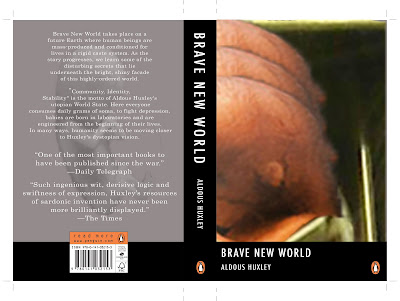
Back cover with the books central motto and my finished final cover for the actual book.

Alpha

Beta

Gamma

Delta

Epsilon


Quotes on the back of the boxes to tie the book in nicely.

Sunday, April 10, 2011

Le 3D book experiment.

Challenge: To make a book that isn't a book but is still a book


Where to start with this one? Here we had the chance to experiment with any kind of material or concept we liked to make a sort of sculptural book. It could be legible but didn't necessarily have to be. It could look like a book but couldn't be a plain front and back covered pages in the middle kind of a book. One major rule was that it couldn't look tacky and had to be finished to a high standard, no easy feat in a short amount of time. Again it was the soma pills that jumped out at me for inspiration but again it's not always the first obvious idea that is the one that works. All week I've gone from one idea to another not really nailing anything. First it was rolling up the chapters of the book onto really small prints and putting them in capsules and then into a medicine bottle with the book cover as the label. Scrap that. Next I started to sew a strange foetal type of doll out of t-shirts and lining from a freshly autopsied teddy bear and I was happy enough with the progress until I was getting to the head and I was told that I was probably wasting my time on an idea that wouldn't work. Me being stubborn with an idea and not wanting to stop before it was fully realised, carried on with it until I was told a third time and I thought it a bit rude to ignore such sound advice, so I left that on the shelf until later. Sewing together the uniforms proved a fruitless pursuit which I gave up on straight away after the first one was done, that was never going to end up anything other than tacky. Back to the drawing board, literally. A quick sketchy outline of a wooden pill idea was drawn up and I got down to making it first with my beloved cardboard and then with wood, card and acetate. Not a million miles away from the dreaded tacky area either, I'll agree. This was proving to be a little frustrating trying to force an idea. Project wooden pill was binned and toy packaging became my next area of interest. It's been a pretty hectic few days but worth it I think in the end. It's lucky I gave up sleep for lent.


Needs a hinge I think to make it open nicely.


I was using card and acetate to make the uniforms, still not a clean enough finish to them though.


Added to this was going to be some of the soma pill casings with the chapters rolled up inside, spilling out of the box.

"Bin it."  

And for a final attempt of getting away from making tack...

I'm aiming to have these printed out onto some thick, possibly laminated card 
and make them into actual toy packaging units. 


I'm hoping to add in the different uniforms and maybe a crest of the caste along with some soma pills, naturally. 


Brave New Covers....

Redesigning the cover of Brave New World

This part of the brief challenged us to look at the many ways in  which we could illustrate the cover of our book, keeping in mind the story, its visual mood, demographic to aim at and making it eye catching enough to stand out amongst other books if it were in a bookshop. Easy enough, NOT. The start of this work was working on our layout sheets to draw out all our ideas before touching a computer, this helped immensely as I had a much easier job working out the idea when I had the concept visualised in front of me. Having taken notes on quotes and themes while I was reading the book, I had some reference material to work from straight away and later I went back to some parts to read again to see if anything really jumped out at me. I enjoyed this part a lot but at the same time I think I could have done more experimenting with more physical objects and photographs of anything I could find to give another dimension to the covers. Next time I get a chance I'm going to try to mix it up a bit more.    


SOMA, being central to the story I thought that using the pill caps
 of the drug soma would be a good angle to work with.

I swear this one is a bit trippy when you stare at it!


"The optimum population", said Mustapha Mond, "is modeled on the iceberg,
 eight-ninths below the water line, one-ninth above"


It's a soma world.


As much as I really like this cover I don't really think it's a good idea to give
away the ending of the book on the front cover, (oops, sorry to anybody who hasn't read it,  nothing happens,
 they're all happy ever after,   o_o  , I swear). It's at the very end and all the way through reading
the book I don't think you would get the reference. 

The 5 caste colours in the story, as simply as I could.


I thought that these four covers would make a good series of covers for the book.
This is the foetus in a (vending) machine portion of the design which was
narrowed down as the best choice to get a final piece from.


This had all started in a weird little sketch.


Nearly there. I really like the classic style of a book cover with a thick bar where the title goes, with a crisp border.
Possibly though the image on the whole page might have more of a dramatic effect.